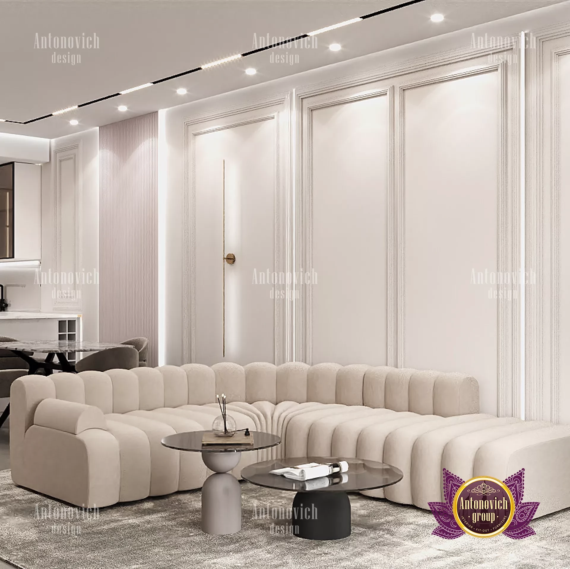
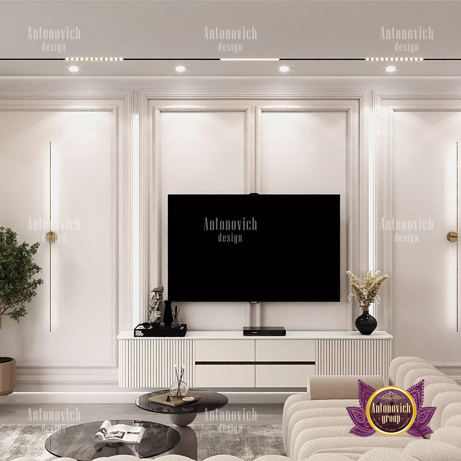
HOW TO USE NEUTRAL COLORS IN INTERIOR
Even while the name "neutral" might not exactly inspire you right away, neutrals are actually an essential component of almost every color scheme you can imagine. But they're rarely the "primary event"; instead, they frequently take a backseat to fashionable statement colors or traditional color schemes. What if, though, you could design a color scheme using just neutral hues? Even better, what if it wasn't monotonous at all? We step in at this point. These rooms reach a degree of elegance, sophistication, and (yes) comfort that can compete with any place that uses color-savvy design, even without the use of showy brights or ominous jewel tones. A sophisticated neutral color scheme for a luxury interior design makes texture, form, and shape even more significant, enhancing the beauty of each unique object in space. The nicest part is that these places may last indefinitely since neutrals are (almost by definition) ageless and durable. This room is proof that neutral doesn't always equal "bland." Gray is undoubtedly one of our favorite neutral colors since it comes in a wide range of tones that allow you to choose the one that best suits your mood. A lot of different textures were used to provide interest and make the room feel opulent and wealthy. The carpet, chairs, and curtain materials all have patterns or textures to give the milk tones more depth.
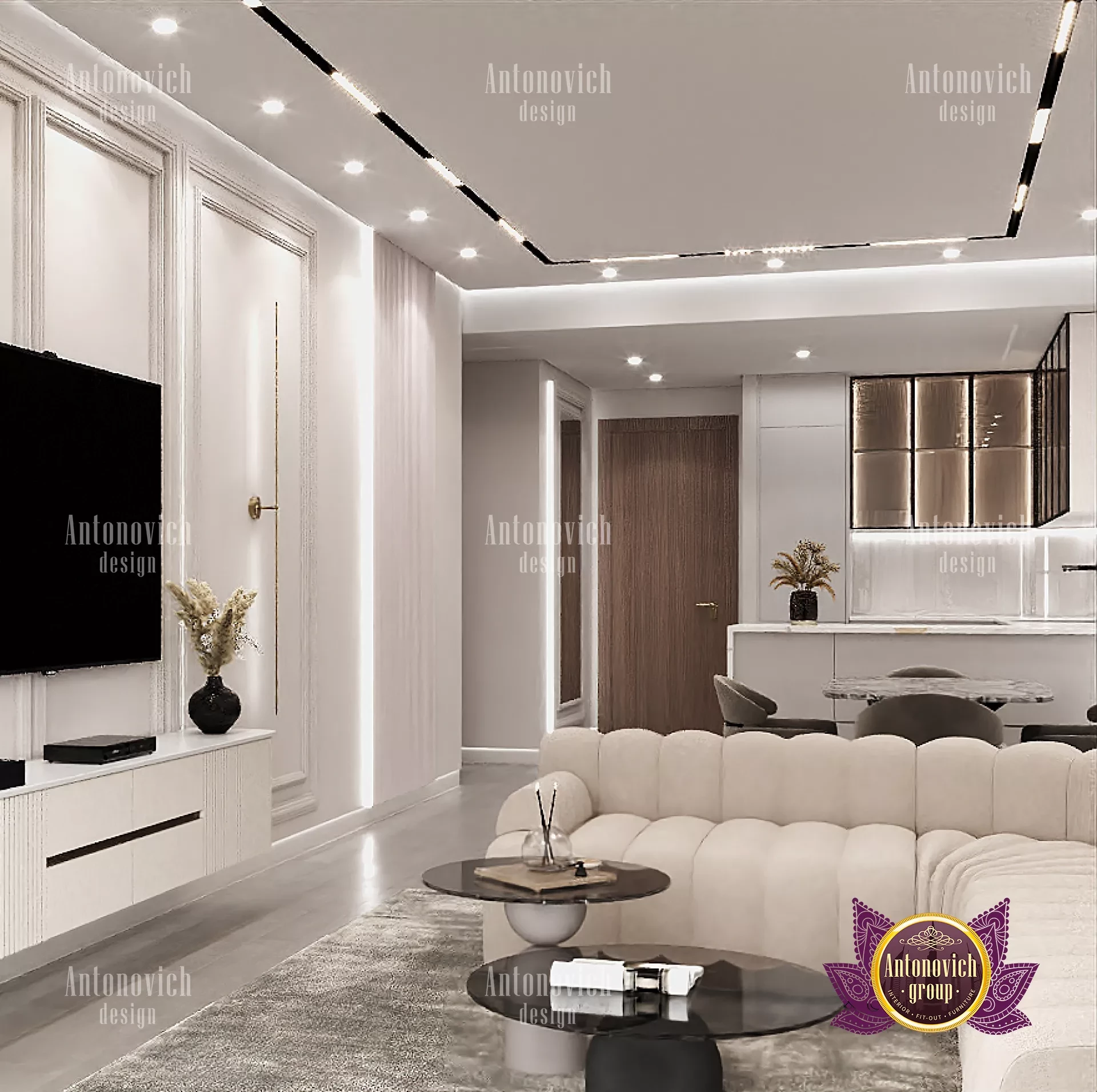
Neutral hues are used in a variety of interior design styles, including modern luxury interior, rustic, and art deco. Neutral colors complement various tones and patterns and serve as a natural base for any setting. For instance, in an art deco room, neutral tones help balance geometric designs, but darker neutrals give a modern space a streamlined, sleek appearance. Discover modest DIY methods to add texture and color ideas for versatility when working with a neutral color palette. Use various tones to emphasize specific sections of a space by adding highlights and accents to a neutral color scheme. To make a room feel more dynamic and interesting, use various neutrals and colors. To add a hint of color to a space that is mostly gray and white, think about using sage green; a pop of pink looks great with warmer neutrals like gold or beige.
Think about the lighting: How a space is lit affects how your eyes see color. Warmer neutrals are intensified by artificial lighting, which has a tendency to have a yellow tint. When selecting your color schemes, take into account elements like the time of year, the day, the position of the sun, and the room's location. Natural light from the north, for instance, imparts a blue tint that makes neutral colors look darker and less saturated, whereas light from the east or west imparts a warmer hue. There are many distinct hues of white paint, and they all seem different in different lighting conditions. Add color with accessories: While pairing large furniture items in neutral colors with neutral-colored walls might have a relaxing impact, this does not need you to give up the color. Instead, add color to the room's various decorations, such as the curtains, throw cushions, and artwork. Choosing colorful accessories makes it simpler to alter the room's design and décor to suit the seasons. Pick the perfect shade: Near-neutral and pure neutral colors all have different impacts on a space. Lighter neutrals enlarge a space while darker, cooler hues give it a homey feeling. Choose a color for the room that complements the style and atmosphere you wish to create.