PROPER USE OF NAVY BLUE IN INTERIOR DESIGN
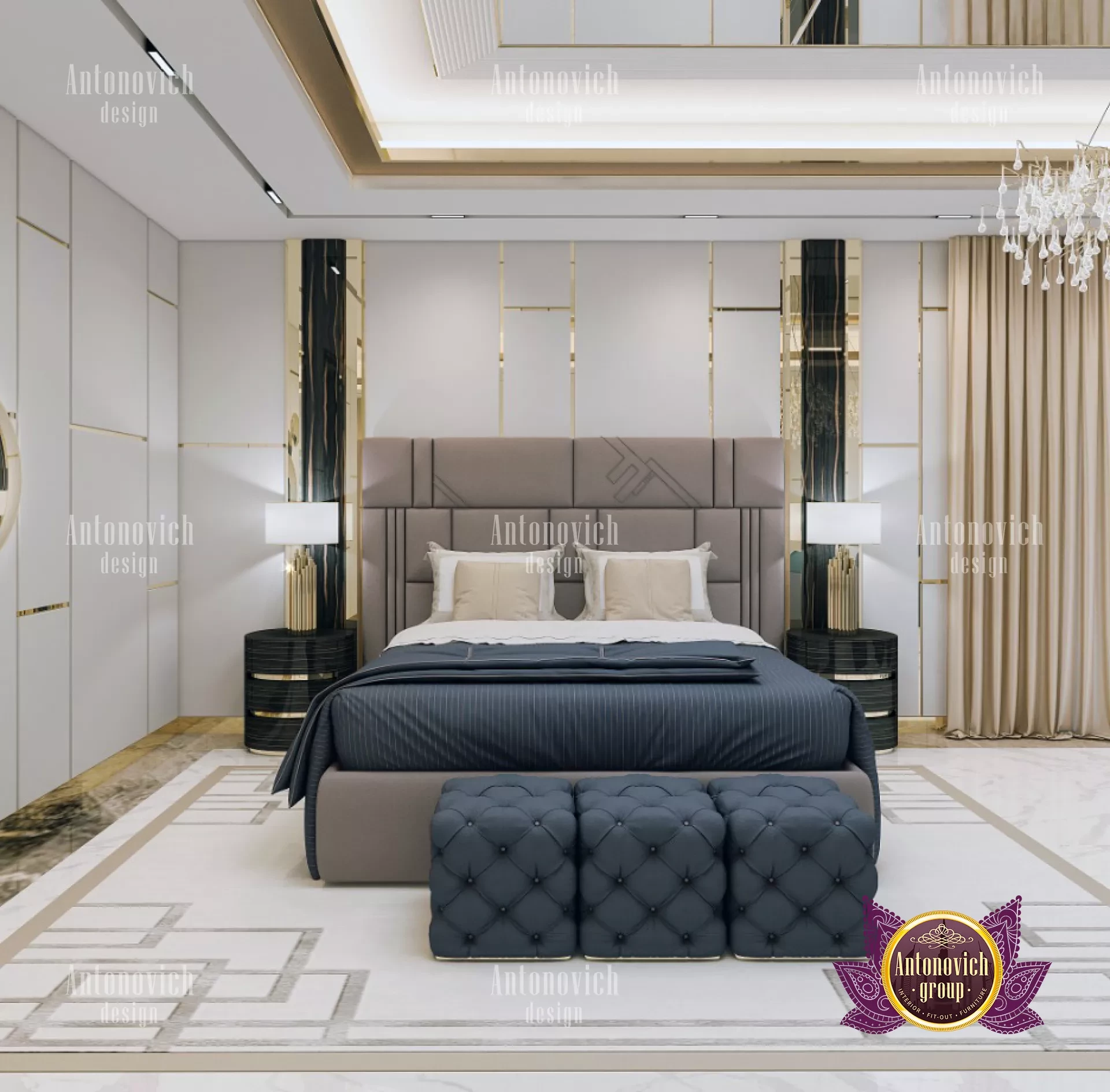
Navy blue is a sophisticated option for a deep color that works wonders in a luxury bedroom to create a comfortable, welcoming atmosphere. Use it as a backdrop for striking colors and patterns or pair it with soft neutrals for a cozy, well-balanced design. To learn how to utilize navy blue in your house, look at these patterns. Inky blue's calming tones go perfectly with mustard's strong presence. The mustard armchair offers a humorous contrast that gives the room a contemporary touch while the blue walls and dark wood storage cabinet give it a formal vibe. The top interior designers used a light gray wall in the same velvet as the floor to add a calmer but still aesthetically pleasing touch. A dark-toned wall should serve as the backdrop if you want to highlight the vibrant colors in the artwork. To emphasize the vivid reds and yellows in these paintings, navy is the ideal color. The softwoods in the room give subdued tones to balance the area, while the blues in both pieces coordinate with the wall paint. The designers produced a strong focal point that contrasts with the rest of the room by painting all the architectural details on the fireplace wall a rich blue.

Searching for hues that complement navy blue? Blue continues to be everyone's favorite color to use in decorating, maybe because it is strong and can feel like a courageous decision, but it also functions something like a neutral, is simple to work with, matches any style, and can be mixed with a wide variety of other hues. And of all the blues, the navy is the one where this adaptability is most obvious. It is a chameleon of a shade, which does mean it can work well with practically any other hue on the color wheel. In certain lighting, it is dark and ominous, while in others, it is subdued and calming. But how can you select the ideal fusion for your environment and sense of style? From zingy yellows to more subdued neutral tones, we asked the color theory experts about their favorite colors to pair with navy blue. In this professional advice, learn which colors complement grey as well. Navy is one of those hues that goes wonderfully with so many other colors. It is mellow and melancholy, relaxing, and quite adaptable. From the traditional creams and whites to my personal favorite earthy greens, which I believe are one of the most dependable color combinations ever. Just take comfort from mother nature there. Along with black and, let's not forget, gold, you can match navy with jewel tones like burnt orange and saffron yellows.
Blue and pink may have formerly been associated with children's nurseries and nursery décor, but in recent years, they have shed those associations and emerged as one of the most popular color combinations in the luxury interior design industry. The traditional colors to select for the most elegant, grown-up look are navy blue and blush pink. The hues' ability to counteract one another is just amazing. Blush pink's subdued warm rose tones balance off any colder deep blue tones, while navy keeps the pink from seeming sickly and too sweet. The undertones need to be accurate. The majority of blush pinks do have that blue undertone, which is what gives them their subdued tone, but make sure to get samples of your paint or fabric so you can see how the two colors blend. One of the greatest colors to wear with blue has to be a pristine white, in our opinion. We will never grow tired of this combo because it is the oldest and most tested.