TURNING A BEDROOM INTO A BEAUTIFUL ONE
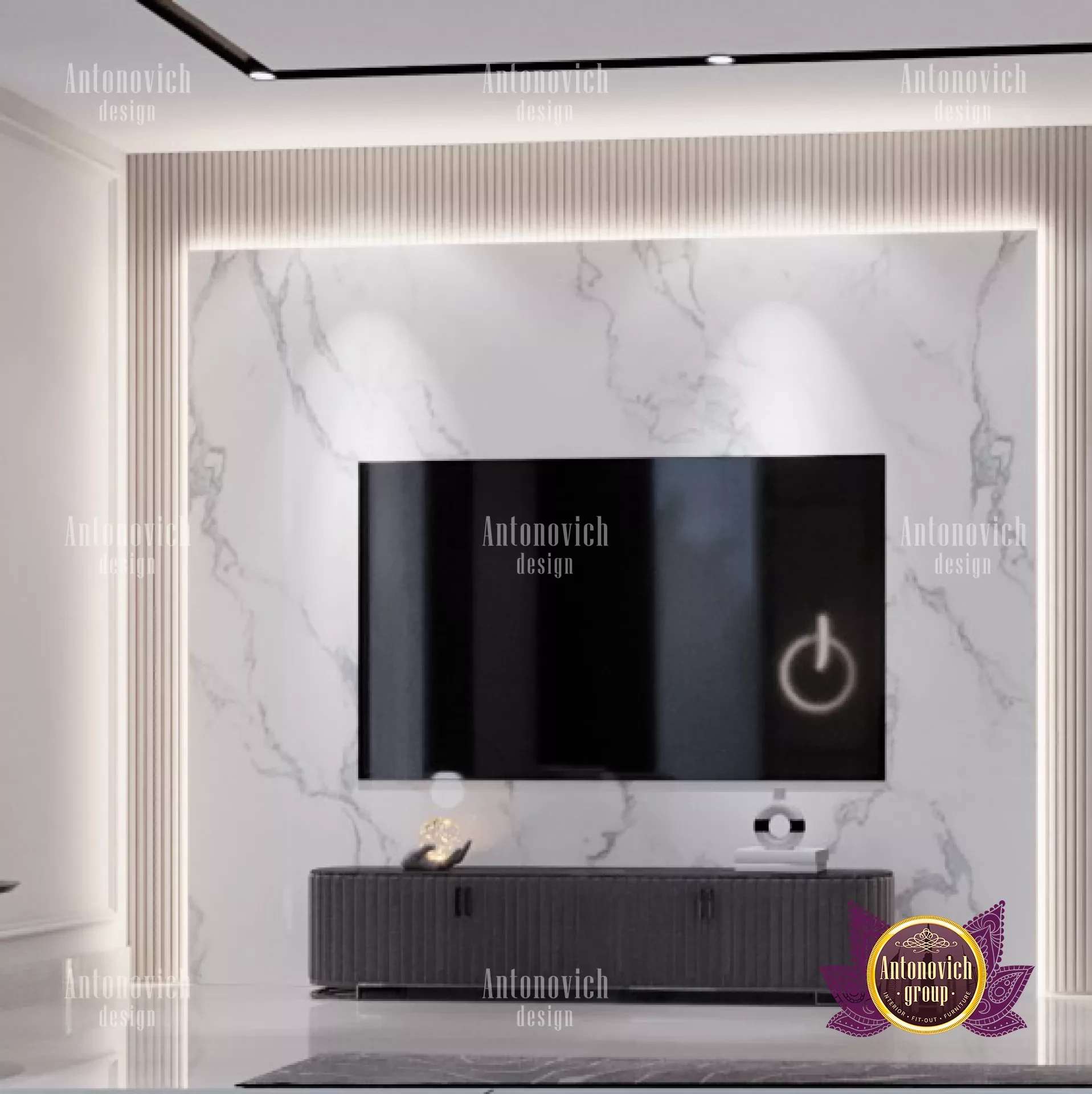
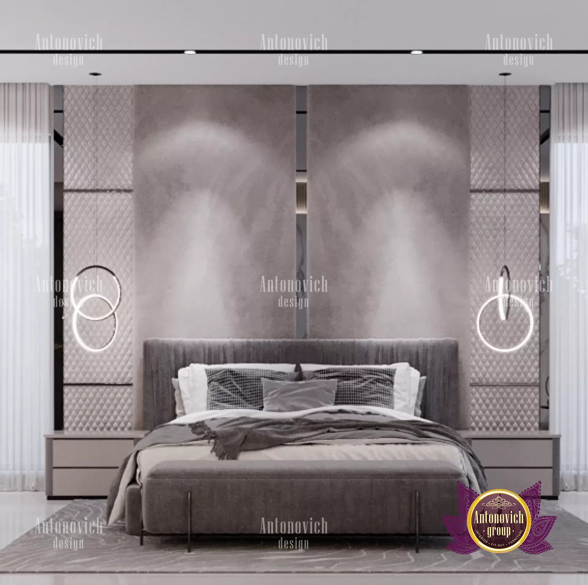
Every area is regarded as a collection of interconnected components. A blank canvas divides a room into many directions, bringing the items in the foreground into sharper, more personal focus. Keep the backdrops simple, and add statement décor and little, simple furnishings. Reduce the number of layers of interior decor elements, such as valence curtains, tapestries, throw cushions, etc., and create a more modern look with solid textures and crisp metal accents. Platform beds, wing chairs, linear consoles, and ottomans are examples of low-rise furnishings that you may add to a room to create a strong visual connection and allow the room to breathe. The characteristics of gray—its naked face and reflectivity—are taken over by all warm grays, cold grays, neutral beiges, and pastels. These gray-based, light-hued colors, like taupe, peach, powder blue, blush pink, and others, tend to reflect light to make spaces appear larger than they actually are. Bring these chic light colors into every piece of furniture, including the headboard and bed, and reflect the light with more gleaming surfaces and slick textures. The all-gray bedroom trend has been sparked by terrazzo walls, marble floors, and crystal chandeliers; you can achieve similar monochromatic effects with color-coordinated floors and walls to gain a wider perspective of the area.
A space appears greater when its physical limits are breached because it feels less clearly defined. Give apertures like windows, balconies, or sit-outs more attention by incorporating them into the room. To create an authentic outdoor interior, add luxury furniture items that tie the rooms together with a common theme. Examples include wooden cots, rattan chairs, log tables, bamboo shades, handmade lamps, and more. On the other side, solid walls may also create the sense of a bigger area by adding beautiful mirror accents or reflecting panels that blur the borders between spaces. With distinctive floor mirrors or dedicated mirror walls that provide fresh perspectives into the room, you may also enlarge the mirror pictures. The boundaries and size of a place are defined by well-chosen luxury furniture. The visual composition of the space may be neatly outlined by adding built-in furniture following a simple scheme. With a floor-to-ceiling wardrobe, the clearance can be totally eliminated, or floating cabinets can make the design much more open. For unique storage, use small silhouettes and monochromatic colors, and experiment with space-saving additions like convertible tables and under-bed storage. Cove lights along the wall panels, among other things, are another way to add more hidden components.
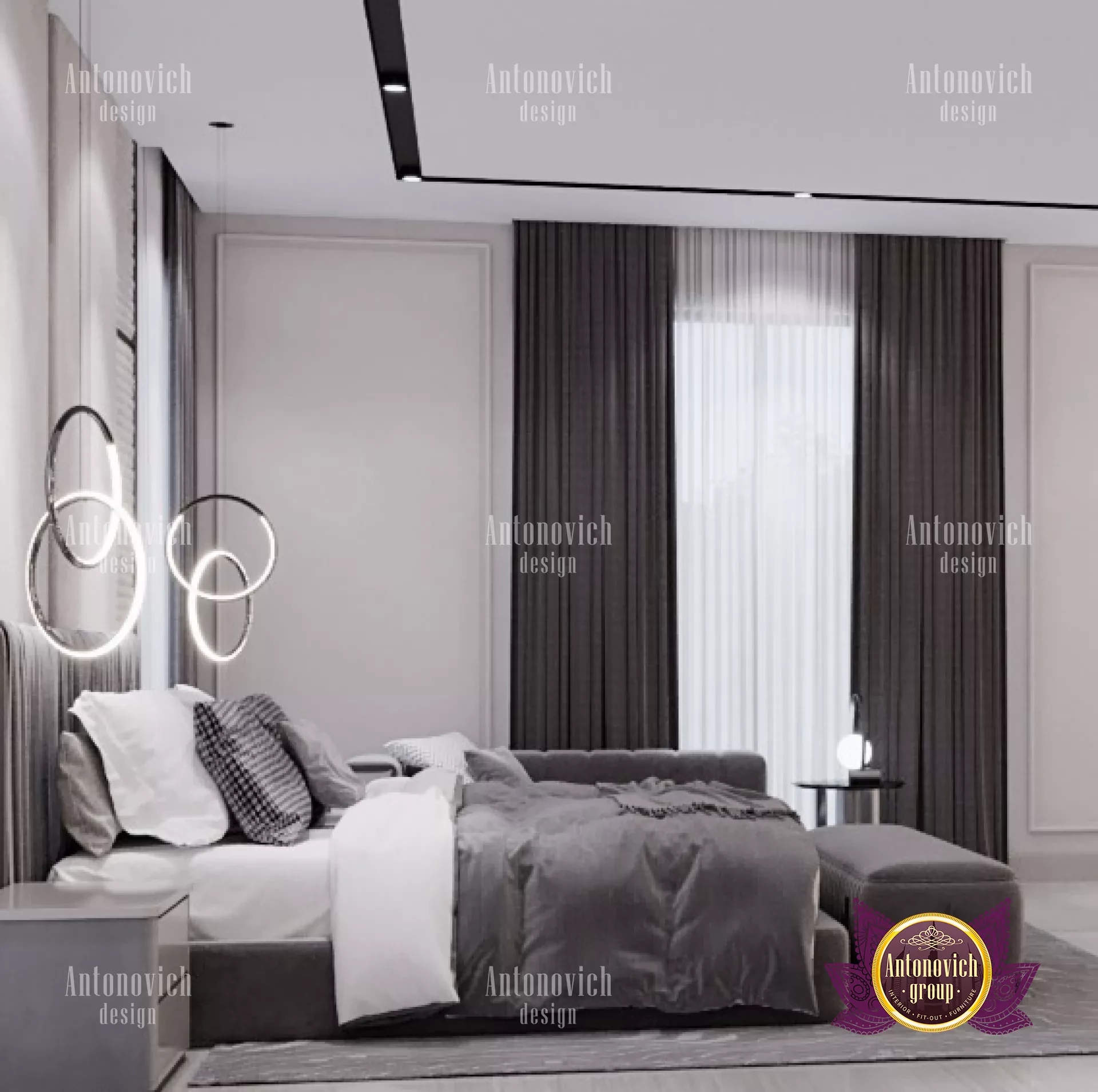
The balance and rhythm of the pieces are intertwined with each other to provide the appearance of a larger area. A straight balance is signaled by symmetrical features like a pair of pendant lights, a cabinet with four doors, a French window with two doors, and more, but the small details, such as the geometric wallpapers, push it beyond the immediate eye. Compositions that lengthen your perspectives and give the impression that the room is larger include grid gallery walls, twin vanities, or even similar décor. Parallel to this, the connection between continuity and illusion is best demonstrated by ceiling-to-floor curtains and sheers reaching along a whole wall, rugs covering an entire floor, and more that connect different portions of a room and construct a coherent interior scene. The key to how a location appears to onlookers visually is these linking components.
